There is so much to be said about album art. Album art sets the tone for what the artist wants to portray for the listener. It is meant to compliment the music. This is done with color, style, subject matter, etc.
Fleet Foxes (2008)
I picked Fleet Foxes out of all the albums out there because the band used 16th century Dutch art to act as the visual component to an album. How interesting.
Background on the Album Art
The art featured on the cover of the album is Netherlandish Proverbs by Pieter Bruegel the Elder (1559).
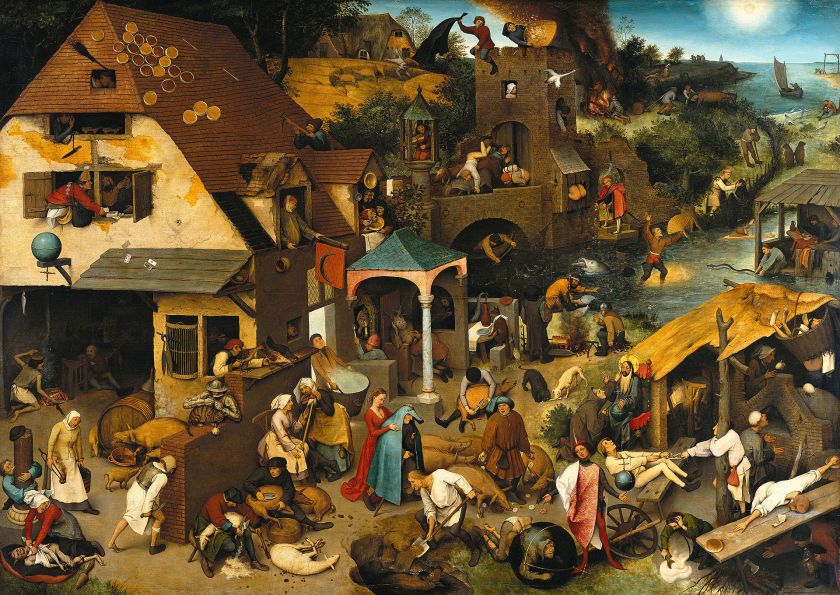
At first glance it looks like a crowded everyday genre scene (a genre scene is a depiction of everyday life). However, if you look closer, chaos ensues. People are hanging out of windows, running in the water, arguing, shaving lambs, in the middle of the panel there is a fox sitting down at a table like a human, its almost humorous.
The day is hectic and it seems like every individual in the painting is dealing with some kind of crazy. I think one of my favorites is in the bottom right hand corner, a woman spilled a pot of food and shes trying to pick it back up with a spoon. For all of my Office watchers:

More on Dutch Art
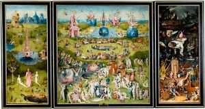
Moving on, this painting is reminiscent of Garden of Earthly Delights (1504) by Bosch. The chaos, the detail, the subdued coloring, the natural elements, strangeness. Something to think about when discussing Dutch art.
How it influences Fleet Foxes (2008)
The overall feel of this album is very chill, pretty, the songs sound almost echoey.
The vocalist for the band commented, “We were trying to figure out what we wanted to do, and my brother had been working out some stuff, when I saw that Bruegel  painting in a book my girlfriend had. I liked that it had a really intriguing meaning, like there’s a story to each little scene. Which I just felt fitting for that record- dense but unified, not a collage or anything. And I liked its Where’s Waldo quality, that it was something you could look at for a long time on a vinyl sleeve and find new little things.”
I think this quote explains it pretty well. It makes their album stand out on a variety of levels.
- The art is distinctive and interesting in that there is a lot to look at
- Who would think to put 16th century art from the Netherlands on the cover of an album?
- It gives people something to analyze and appreciate
The music on the album is relaxed enough that the listener could put it on and look at the cover art. Seems like a good time to me.
Songs to listen to
All of the songs on this album are lovely. These are just the three that stuck out to me.
*The album is available on Spotify
Image Credit:
